I named this blog carefully, in the belief that attention to the small things is often what transforms mere existence into Living. It is also a study in how this happens – and rather too often fails to.
I think that the truest reflection of the nature of a place or people is found not in the grand gestures, but in the small, everyday matters that contribute to making life what it is or isn’t. Sheer experience has shown that the approaches to this are not the same everywhere: some cultures appear to attach more importance to both pleasing appearance and high quality than others; one of my perpetual gripes about Britain is that so much here feels temporary and insubstantial, even when it is perhaps not. Maybe we need to pay more attention to the details.
Or rather, it’s not that we can’t do things well – but the average British mindset seems to view everyday life as a fairly rudimentary affair, and any grace as a luxury for which one must pay heavily.
This is a great pity, given the tendency of the British to grumble about everyday life, because I firmly believe that the solution is actually in people’s own hands. Special occasions may be great, but what we do with each and every day has a larger impact on the full experience of life. Hence my valuing of the notion of sprezzatura.
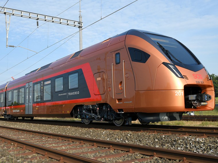
I am going to take several posts to examine some rather esoteric example of how different nations approach everyday matters. This post is one of two about transport design. On the face of it, this may not seem an important matter – but quite apart from the technical complexities of the subject, the way in which nations treat their travel spaces is a small but accessible window on the national psyche (I recall a senior Ford marketer once telling me that in Britain people buy cars on the strength of the exterior, whereas in Germany it is the interior that counts…)
Getting transport design right has the potential to transform a trying necessity into a stylish, enjoyable experience.
Railway carriage design might be expected to be important to the British, given the length of time many of them spend commuting. It is also a challenging design problem, given the many constraints that bear on it – from the inherently awkward, tube-like shape of the vehicles, to the increasingly stringent health and safety requirements, let alone the need to squeeze huge amounts of functional technology into confined spaces while keeping the whole usable by the public. I have travelled thousands of miles around Europe by train, and have experienced many approaches to this conundrum, some much more successful than others from the passenger’s perspective. One cannot but help compare and contrast. A comfortably-executed train journey is one of life’s pleasures, and with the need to get people out of their cars, one might have thought attention to that experience would be high on operator’s agendas. It is – sometimes.
So here is a selection of interiors from around the railways of Europe, with a little cultural commentary…
We’ll start with the home offering. Given the fragmented nature of Britain’s railways, there is no standard design. Companies do their own thing, and it is fair to say that maximising bums-on-seats is their top priority. One can forgive them the inherited problems caused by vehicle dimensions significantly smaller than those on the continent (notably 300-plus mm less width) – but arguably this is all the more reason for creative solutions. In the 1850s, regular-class accommodation was little more than cattle wagons; while standards have obviously risen across the board, the mentality for standard-rate travel in the U.K. is still largely the same…

Exhibit 1 is fairly typical of a British inter-city train today. This is a First Great Western example, and shows what happens when you give a train to what is basically a bus company. The high back seats are a legislative response to rail accidents, while the airline configuration does provide leg room and a little privacy in a high-density interior. But the lighting is stark and far too bright, while the colour scheme is naive and garish – precisely the wrong shades of pink and blue. The overall effect is bleak: I can say from experience that this is not a restful environment in which to spend a couple of hours. In fact, if it were not such a challenging assault on the senses, it would be downright unpleasant.
The same company is taking delivery of a new fleet of government-specified trains, and exhibit 2 shows the latest offering:

I have yet to travel on one of these trains. I find the pared-back, more ‘streamlined’ interior an improvement, though apparently the seats are uncomfortable. Streamlined is a good approach for rail vehicles, given both their inherent shape and the safety considerations involved. But it is still just rather dull, and a real disappointment compared with the sleek enticement to travel that these new flagship trains could have been.
Virgin is also taking delivery of the same fleet. Exhibit 3 shows an original Virgin Pendolino interior, which shows what happens when you give a train to what is basically a cut-price airline. I found to be extremely cramped and claustrophobic, not helped by the sloping walls (needed to keep the vehicle within its dynamic envelope when tilting). I also greatly dislike Virgin’s overly funky, pop-approach to design (and affairs generally – note to marketers, I don’t want to be told I’ve successfully bought a ticket with the word wayhey!!! in huge letters – where’s your dignity, let alone mine?)

We have more garish primary colours, naff blue lighting in the luggage areas and the generally low-brow feel of a fast-food outlet.
The refurbished fleet on Virgin’s East Coast route fares a little better; this is the company’s second attempt at a train interior; perhaps they are slowly learning. (Exhibit 4):

…while the same company’s interior (exhibit 5) for the new Inter-City fleet (not yet in service) is at least a little less gloomy than the Great Western offering for the same train – but is still garish in its primary brightness. I suppose this might play well with Virgin’s core youth market – but what about the other segments of the travel market? Still, compare and contrast with exhibit 1…

One of the chief failings of the private companies that entered the British rail market was that they has little ‘feel’ for rail design issues such as the inherent form of the vehicles, something exacerbated by the ‘need’ for loud branding.
Chiltern is a long-term franchise, and it has been a good innovator over the years. Exhibit 6 shows the interior of one of its latest inter-city offerings. I must admit I am not sure what to make of this, and I have not sampled one in the flesh. Chiltern evolved from an old British Rail sector, and I think the its inherent feel for the design of rail vehicles shows, but while this arguably has atmosphere and ‘presence’, it is also perhaps rather drab, and just too subdued.

We start to look a little further afield now. Exhibit 7 (below) shows the interior of an Irish inter-city coach from the flagship Dublin-Cork service. The outside ‘face’ of these trains is daringly raked – but as a result, the interiors are all the more of a disappointment: dull, cluttered and visually noisy, with little design credibility at all. Not sure the Irish have really developed much design cred as yet. Straight out of the 1980’s – and they haven’t even got the excuse of a restricted loading gauge.

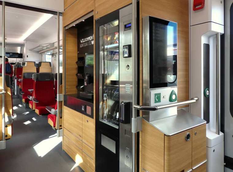
Things start to get more interesting when one crosses the Channel. Deutsche Bahn is a highly efficient operator, and as expected its best fleets are high in quality. German design perhaps lacks a little visual flair, but everything feels very solid, with lots of leather, glass and blond wood; there is a hi-tech sleekness to it all. Exhibit 8 shows the interior of an ICE high speed train. I like the imaginative use of glass partitions to keep the interior open and airy, while the snazzy mirror-fronted information display is much less obtrusive than those in British trains. What’s more, the electronic seat reservation system always seems to be working…

…and who can resist this opportunity (Exhibit 9 – which I have taken more than once)? In a move that would give British H&S bods nightmares, it is possible to sit in the driving vehicle, and watch the route ahead unfold at 300kph over the driver’s shoulder. The driver can blank the screen out if (s)he needs, as it is liquid-crystal glass. The seats are even banked for a better view…

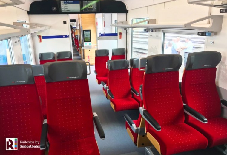
Heading to the rail paradise that is Switzerland, we find low-key restraint. SBB has a very modish image, but its interiors are quite sober. However, the quality is again high – more like the fittings on a luxury car. Exhibit 11 (below) shows the upper deck on an inter-city set; the careful lighting mitigates any feelings of claustrophobia in what is a fairly restricted space.

Exhibit 12 shows another glory of Swiss railways – the retention of proper restaurant/bistro cars. This is the design for the latest upper-deck incarnation, and they still have proper table linen, cutlery and china… The monochrome colour scheme is nicely relieved by just the right hit of purple…

More of a surprise comes from some of the nations traditionally associated with good design: Italy, Spain and Scandinavia. The Italians have never quite translated their mastery of automotive design to their railways, and the results often look as though they are trying too hard on the outside, and not hard enough on the inside (exhibit 13). Interesting to note that the same capacity preoccupation exists on private trains in Italy as in Britain…

First class on the FS Frecciarossa is a little more like it (exhibit 14) –

but in fact some of Italy’s slightly older trains actually seem to have more style, here almost a classic mid-century feel… (exhibit 16)

At least first class on the privately-operated Italo has a little more Italian brio about it (Exhibit 16). I’m not sure that all that shiny caramel leather really works, but I like the sleek partition behind them and the generous sense of space. The same preoccupation with advertising seems to be present…

Spanish railways also major on cool design (Exhibit 17). This is the interior of one of RENFE’s AVE high speed trains. Admittedly this is first class; the leather seats are nicely tailored, and the colours scheme cool – but I wonder how long that pale wood floor will stay looking pristine. All in all, a good offering from a network that has been extremely successful in attracting travellers from their cars in recent years.

In design terms, Danish trains are very disappointing. I suppose they do reflect the low-key organic Scandinavian approach to design, but despite the abstract end-panel graphics, I would have hoped for something more achingly stylish than this…

(Exhibit 18)
I am of course saving the best until last. Of all the nations of Europe, when it comes to rail, the French seem to have the best, most innate design sense; from their graphic design to the chic announcement chimes that are almost a national institution, and the contemporary daring of some of their station architecture, they seem to have the right conditions in place to perceive a rail journey as a stylish rather than functional matter. Their train interiors reflect that. This is the nation that put its best fashion designers to work on its train interiors, and the latest offering from Christian Lacroix strikes an excellent balance between the inevitable constraints of a railway coach and doing something chic, different and yet accessible with it. (Exhibit 19). From the asymmetrical seat backs to the integrated reading lights, the funky carpet and the quite daring choice of colours, this is a stylish yet fun environment in which to travel.

The following images show a refurbished elderly regional train in France, and the latest experiments for the next generation for inner suburban design. Can you imagine such things happening in Britain?


By contrast, Exhibit 22 shows the latest British offering for the forthcoming Crossrail service in London; no contest. (I refuse to call it by the fawningly sentimental name Elizabeth Line). Even the upholstery (which I suppose is meant to be stylish) looks as though it is trying too hard and yet simultaneously fails to make any impact.

Exhibit 23: Credit where credit’s due: the interiors for the new generation of Eurostar trains is up there with the best, something close to what this service should have offered from the start. It was always the best offering on British soil – probably because the designs were French. The latest version, of which this is the buffet, is a German designed train, with an Italian interior by Pininfarina. Why aren’t all trains like this?

It is perhaps pushing the point a bit far to claim that national train interiors reflect national temperaments and priorities – but there is nonetheless a wide variety of approach. As I said at the start, the design of things like train is a significant factor in the whole experience of using them, and it is not as though there is no precedent – from Pullmans to Wagons-Lits, style has always been part of rail travel. But in the case of modern British offerings, there is as usual, still too much reverence for traces of ‘heritage’ in the use of bulbous chair shapes, swirly carpets and soft-font signage, while the actual (hidden) agenda is pack ‘em in cheaply in Standard and fleece ‘em for First.
It is a huge disappointment that Great Western Railway (itself a self-conscious resuscitation of a historic brand) has seen no better than to regale its state of the art trains with fake-heritage insignia and a dull, supposedly historic livery. It is a far cry from the strong contemporary image of British Rail in the 1960 and 70s.
There is insufficient clarity and simplicity of line and surface in the interiors of modern British trains, and too little reference to the form that the design needs to follow. This is all the more apparent when one sees some of the crude exterior treatments that have also proliferated, which make no reference to the inherent shape of the train whatsoever. Likewise, the choice of colours is often ill-considered: there is a world of difference between a chic acid green and a dull bottle green, such as GWR have seen fit to throw wholesale over the exterior of their ultra-modern new trains. Graphic art is another field where the French excel, whereas too many British efforts are just dull and clunky.
This is not, however, to say that the continentals always get it right either, as the preceding pictures show.
But there, in one, is the difference in temperament after all – between the sleek chic of the best continental design, and the dull clunky norm in Britain. From the way they dress to the way they furnish their homes, it seems to me that the average Brit has learned little from the supposed design revolution of recent decades. Even IKEA modernism was just another passing fad. So I very much doubt that the average Briton even notices poor design when it comes to public transport, even if they still suffer its ill effects. For all that we bang on about being a world-class nation, when it comes to matters of public utility – not to mention the ‘shop window’ that public transport presents to the visiting world at large – too often we are plain, simple disappointing.
I suspect visual literacy just isn’t in our genes.